Animated AI Nebula Button in React Native with Particles
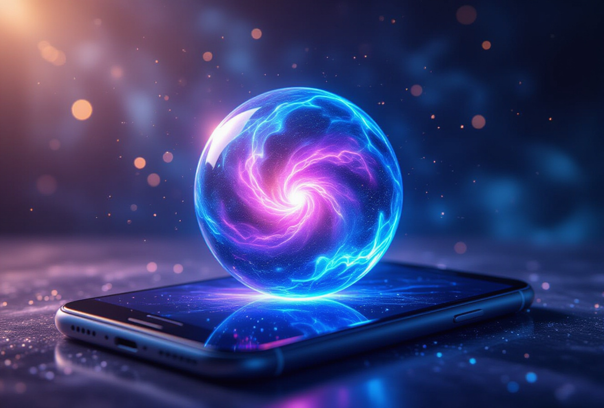
A good button makes you want to press it. TAMSIV's AI button is a living nebula that invites conversation. It's not just a circle with a microphone: it's 8 luminous particles that dance, breathe, and react in real-time to every interaction.
This button is probably the interface element I spent the most time on per pixel. Not because it's the most functionally important, but because it's the first point of contact between the user and artificial intelligence. If this button doesn't make you want to talk, everything else is useless.
Key points
- The nebula button uses 8 animated particles via React Native's native Animated API, without Lottie or Skia, for total control over every frame.
- 4 distinct states (idle, listening, processing, responding) with
Animated.springtransitions for organic movement.- Guaranteed 60fps performance even on 3GB RAM devices thanks to
useNativeDriverand zero React re-renders.- The idle state rhythm mimics calm breathing (~4 seconds per cycle), creating a living presence effect.
Why invest so much time in a simple button?
The short answer: because it's the first contact with AI. The long answer involves psychology, design, and mobile performance.
According to research from the Interaction Design Foundation, users form an impression of an interface in 50 milliseconds. No time to read a tutorial. No time to understand the value proposition. 50ms to decide if the app is "pro" or "amateur."
TAMSIV's AI button is the most visible element on the main screen. It's the only component that moves when everything else is static. It must communicate three things without a single word: "I'm here," "I'm ready," "talk to me." If you have to explain to the user how to use a button, the design has failed.
I explored several avenues before arriving at the nebula. A simple pulsating circle, too generic. An animated microphone, too literal. A sound wave, too technical. The nebula was born from an observation: cosmic clouds seem alive without being threatening. They attract the eye without being aggressive. This is exactly the emotion I wanted for the AI button.
How does the technical architecture of the nebula effect work?
The most important technical choice was to refuse shortcuts. No Lottie (pre-rendered animations), no Skia (2D canvas). Entirely on React Native's native Animated API. Why? Because the 4 states of the button must blend dynamically. A Lottie animation is fixed: it plays a file from A to Z. The nebula state must react in real-time.
The architecture relies on 8 blurred circles (blurRadius) that move in sinusoids. Each circle has three independent parameters:
- Position: sinusoidal movement in X and Y with slightly different frequencies, creating figure-eight trajectories (Lissajous curves).
- Opacity: oscillation between 0.3 and 0.8 to create areas of variable light density.
- Scale: subtle variation between 0.8 and 1.2 to simulate depth.
The blending of these 8 circles creates areas of light concentration that appear and disappear naturally, exactly like a real nebula. The color system remains between TAMSIV's accent blue (#137fec) and a soft purple, consistent with the app's dark theme (#101922).
What are the 4 states of the button and how do they transition?
Each state modifies the parameters of the 8 particles progressively, never abruptly. Transitions use Animated.spring instead of Animated.timing for an organic feel: spring generates a slight natural overshoot that linear timing cannot reproduce.
Idle state: breathing
Particles move slowly. The amplitude of movement is low. Brightness is moderate. The complete cycle lasts about 4 seconds, which corresponds to the calm breathing rhythm of a human at rest. This is not a coincidence: according to studies by Respiratory Research, the average resting respiratory rate is 12-20 cycles per minute, or 3 to 5 seconds per cycle. By aligning the animation with this rhythm, the button unconsciously activates a sense of calm and trust.
Listening state: attention
The user presses and speaks. The amplitude of the particles increases by 50%. Brightness increases. The particles move slightly away from the center, as if the button is "opening its ears." The transition occurs with a spring with high stiffness for an immediate reaction to touch.
Processing state: convergence
The user releases. The AI processes the request. The particles converge towards the center and the rotation accelerates. The visual effect evokes a vortex that "digests" the information. This is crucial feedback: the user knows their request is being processed without needing a spinner or "Loading..." text.
Response state: audio pulsation
The TTS plays the AI's response. The particles pulsate in sync with the audio amplitude. The higher the volume, the greater the amplitude of the particles. This is the same principle as Spotify or Apple Music's audio visualizers, adapted to a 60x60 point button. I detailed the complete audio pipeline in the article on the voice pipeline.
How to guarantee 60fps on entry-level devices?
Animating 8 particles with position, opacity, and scale means 24 simultaneous animated values. On a flagship, it's trivial. On a device with 3GB of RAM and a Snapdragon 400 processor, it's a serious challenge.
Rule number 1: useNativeDriver: true on every animation. When the native driver is enabled, the animation is entirely handled by the native thread (UI thread), not by the JavaScript bridge. The JS thread is free to handle business logic (audio recording, WebSocket sending, AI response parsing). According to the React Native documentation, the native driver can improve animation performance by 60% on average.
Rule number 2: zero React re-renders. Animated values are Animated.Values that mutate without triggering React reconciliation. The component never re-renders during the animation. No setState, no changing animated props via state.
Rule number 3: animated properties are exclusively transform (translateX, translateY, scale) and opacity. These properties are GPU-accelerated on Android and iOS. No animated width/height/backgroundColor, which would require a layout recalculation at each frame.
Result: constant 60fps even on tested entry-level devices. I initially started with 16 particles before reducing to 8 without perceptible visual loss. This is a classic compromise in mobile development that I also apply in the voice dictaphone and the inline interface.
What role does the psychology of movement play in design?
Movement in UI is not decorative. It is informative. Each animation must answer an implicit user question:
- Idle state: "Is the AI available?" Yes, look, it's breathing. It's waiting for you.
- Listening state: "Can it hear me?" Yes, look, it reacts to your voice.
- Processing state: "Is my request being processed?" Yes, look, it's working.
- Response state: "Is the AI speaking?" Yes, look, it pulsates with the audio.
Disney Animation Studio formalized this principle in its 12 basic principles of animation. Two are particularly relevant here: "anticipation" (the button prepares before acting) and "follow through" (the button continues to react after the action).
The most gratifying feedback from testers was: "It looks like it's waiting for me to talk to it." This is not a compliment on the animation. It's a compliment on the emotion. The animation succeeded in creating a sense of presence. And presence is what transforms a tool into a companion. I explained this philosophy in the article on voice personalization: AI should not just be useful, it should be pleasant.
Why not use Lottie or Rive for this type of animation?
The question is legitimate. Lottie is the standard solution for complex mobile animations. Rive (formerly Flare) is its more performant competitor. Both could have created an impressive nebula effect. But with a critical limitation: animations are pre-calculated.
TAMSIV's AI button has dynamic states that depend on real-time data. The "response" state synchronizes the particle amplitude with the TTS audio volume. This volume changes 60 times per second. A Lottie animation cannot adapt to a real-time audio stream: it plays a fixed sequence.
The native Animated API offers frame-by-frame control. I can modify any parameter at any time without reloading an animation. It's more work to code, but the result is more alive. This is the same logic as in the feed and gamification: animations reactive to data are always more engaging than fixed animations.
How does the button adapt to the app's theme and colors?
The nebula button does not exist in isolation. It is part of a coherent design system with TAMSIV's dark theme: background #101922, accent #137fec, secondary text #9ca3af.
The particles use a gradient between the accent blue and a purple (#8b5cf6). This choice is not aesthetic: it is functional. Blue is the accent color for the entire interface, buttons, links, indicators. Purple is used only for AI. This chromatic distinction allows the user to instantly identify AI-related elements without reading text.
On a dark background, luminous particles create natural contrast without the need for borders or shadows. This is a key principle of dark mode design: light becomes the highlighting tool, not lines. I applied the same principle in the contextual search with swipe and in the lazy registration onboarding.
Frequently Asked Questions
Does the nebula button consume a lot of battery?
No. The animations exclusively use the native driver and GPU-accelerated properties (transform, opacity). The battery impact is comparable to a standard CSS animation on the web. The particles do not spin when the app is in the background.
Does the effect work differently on iOS and Android?
The visual effect is identical on both platforms thanks to the Animated API which abstracts the differences. The only variation is the blur: iOS uses a more performant native blur, Android uses a workaround with reduced opacity that gives a visually similar result.
Can the button colors be customized?
Currently no. The colors are linked to TAMSIV's design system. Theme-based customization is conceivable in the future, but it would require rethinking the AI palette for each color variation.
Why 8 particles and not more?
I tested from 4 to 16 particles. Below 6, the effect loses its richness. Above 10, the visual gain is negligible but the performance cost increases. 8 is the sweet spot tested on devices ranging from Samsung Galaxy A13 to Pixel 8 Pro.
Is the button accessible to visually impaired users?
Yes. The component includes a descriptive accessibilityLabel and an accessibilityHint that indicates the current state. Screen readers announce "AI button, ready to listen" or "AI button, processing" depending on the state.